Posted on The Distress Signal | web-development
When astro 4.0 dropped over the holidays and I saw the announcement about the toolbar—I immediately knew how I wanted to use it. For a while now, I’ve been including a quick little component in all my development builds—just a badge hovering at the bottom of the viewport showing the current breakpoint. I’ve always found it handy, especially when just starting on layout, to quickly see if I’m currently at size ‘md’, or ‘xl’, etc. So when Astro announced they were adding a toolbar on dev builds to house this kind of garbage, it seemed like an obvious fit.
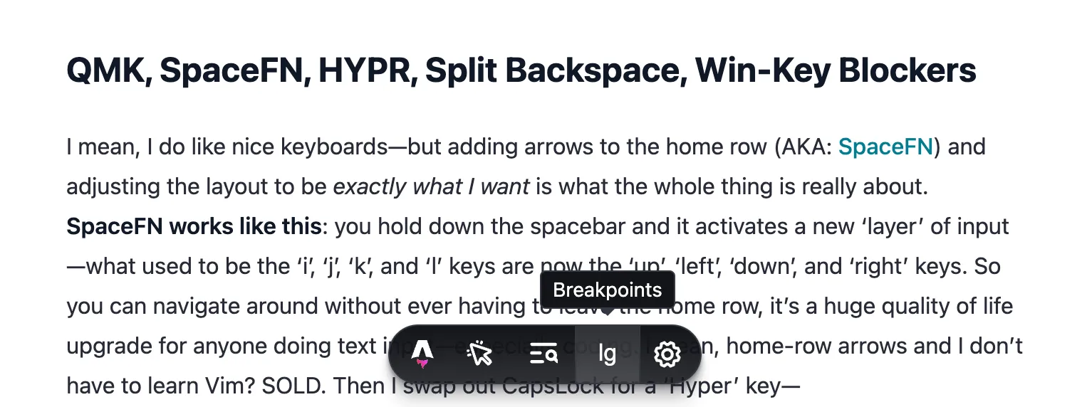
A screenshot—hey, the ‘lg’ breakpoint is active. K thnx bye.
Three months later, I finally got around to knocking it together—the holidays are a time warp with two kids under 5. As I say, it’s a stupid little app, but it does the job. Shows the current viewport width—expressed as a tailwind class—in the toolbar. It’s so stupid in fact, the apps logic is entirely contained within the .svg icon. 🤣
<svg width="100%" height="100%" viewBox="0 0 24 24" xmlns="http://www.w3.org/2000/svg">
  <style>
    text { fill: white; font-family: Arial, sans-serif; font-size: 20px; }
    .text-content { display: none; }
    .text-sm { display: block; }
    @media (min-width: 768px) {
      .text-content { display: none; }
      .text-md { display: block; }
    }

    @media (min-width: 1024px) {
      .text-content { display: none; }
      .text-lg { display: block; }
    }

    @media (min-width: 1280px) {
      .text-content { display: none; }
      .text-xl { display: block; }
    }
    @media (min-width: 1536px) {
      .text-content { display: none; }
      .text-2xl { display: block; }
    }
  </style>
  <text x="50%" y="50%" class="text-content text-sm" dominant-baseline="middle" text-anchor="middle">sm</text>
  <text x="50%" y="50%" class="text-content text-md" dominant-baseline="middle" text-anchor="middle">md</text>
  <text x="50%" y="50%" class="text-content text-lg" dominant-baseline="middle" text-anchor="middle">lg</text>
  <text x="50%" y="50%" class="text-content text-xl" dominant-baseline="middle" text-anchor="middle">xl</text>
  <text x="50%" y="50%" class="text-content text-2xl" dominant-baseline="middle" text-anchor="middle">2xl</text>
</svg>
Anyway, I added it the official Astro integrations library (🎊 500 people have installed it so far 🎉), if this sounds like the kind of thing you’d find handy you can give it a try.